Yesenia Paquette
Nothing Wasted Logo
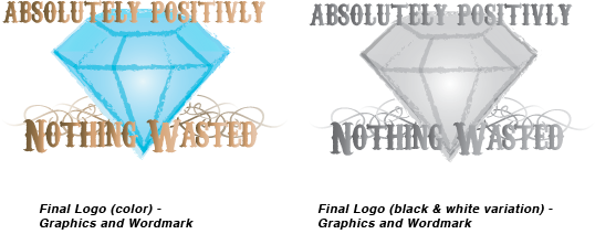
Artist's Statement
I wanted to keep the logo looking elegant but also with that vintage sort of look? So I used the elegant curls for the behind the diamond but I also used a stroke to keep the diamond looking kind of older, or not as new? Using the gradient in the middle I tried to even it out a little and make the diamond seem more shiny, kinda like even if its been used its still something new and good and just as good as it was before. The gradient on the text and the curls are more so for the elegant look I was going for but I purposely made the colors a goldish rust color to give a sort of old to new effect