Kruti Patel
Nothing Wasted Logo

Artist's Statement
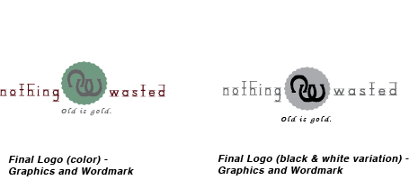
Mr. Elvin Jackson requested that his design encompass his company well. He specified that he wanted the logo to give off a country chic feel and vintage look and look more masculine to go with his style. He also wanted the colors turquoise and rust to be incorporated into the logo. Taking all these specifications into consideration, I designed a logo and wordmark that I hope will present Mr. Jackson’s company well. For the logo, I used horseshoes, as I feel that they give off a country chic feel. In addition to this, I used a bottle cap for the logo as I felt that he used a lot of similar kinds of items when making jewelry. I chose Old is Gold for the catch phrase as I felt that Mr. Jackson is using items people usually throw away to make something that is vintage. I also wanted to symbolize that using old items in art can create something beautiful. All in all, I created a logo and wordmark that was vintage, country chic, and embodied Mr. Jackson’s art well.