Kayla Hewitt
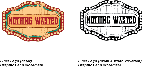
Nothing Wasted Logo
Artist's Statement
In this design I went for a country almost carnival style. I incorporated the vintage feel through the shape of the logo and the brush stroke aging. The lines in the background are meant to look like cardboard corrugation and the brush strokes are also the parts of it that didn’t tear cleanly through. The circles bordering it are meant to look like the lights one would see on a sign outside a theatre or something of that sort, so as a whole it looks like someone took pieces of lots of old unused things and made them into something new. I used a more typical country/ rustic style font and made it look like it was stamped onto a sign. I used the client’s requested colors (red and turquoise) and more neutral colors (browns and cremes) to make the turquoise accent pop more.