Eve Class
Nothing Wasted Logo
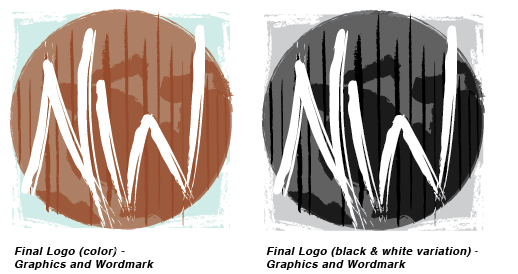
Artist's Statement
Knowing that Mr. Jackson wanted the texture of ripped cardboard incorporated into his logo, I imitated that for the background of the text. I tried to keep the all edges of the logo rough to stick with this motif and with the rustic vibe. I used a color similar to cardboard for the main graphics, but a warmer version because when when describing his ideal color palette, Mr. Jackson included red and rust, both of which are warm colors. I added a pale turquoise background, in part because Mr. Jackson requested turquoise, but also because I felt it really grounded the logo.