Bryan Truong
Nothing Wasted Logo
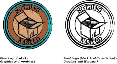
Artist's Statement
This piece represents the vintage style and “rustic” look of the company, displaying its nature and design, a reason why I chose this specific font. I chose the colors of tan, rust, and teal because those were the colors desired in making the logo. But I also picked these colors for another reason, they all have different meanings. Teal is like the color of the sky, meaning that the sky is the limit, nothing is impossible. Rust represents the rustic appeal of the company, having a “homemade” and “vintage” feeling to the products produced. Lastly, tan represents conservation, the desire to be eco-friendly and to make new things out of recycled objects. In the logo I drew a box with circles of various stroke sizes surrounding it, the circles representing eternity creating the notion that the company will last forever, or at least a long time. The box represents potential, it shows that the company has many things it potentially can have in store. Through the box, it symbolizes that Nothing Wasted can contain anything that a client needs, having endless possibilities.